Enable display in Raspberry Pi

Do you want to connect your Raspberry Pi to an external display via HDMI? If yes, follow these simple steps:

  1. Install operating system on memory card
  2. Open config.txt in the memory card
  3. Search following lines and uncomment these lines:
  4. hdmi_safe=1
  5. hdmi_force_hotplug=1
  6. Now save the file and insert memory card in Raspberry Pi Module
  7. Insert one end of HDMI cable in the Raspberry Pi and other side in the monitor.
  8. Now you should be able to get GUI of Raspberry on the monitor.

A peek into IIT Bombay

I was fortunate to visit IIT Bombay for a duration of three months, from October to December 2016.  I became part of a well-established research lab, SEIL, which works in energy sustainability. The team members are dynamic, diverse consisting of PhDs, MTechs, research staff and one driver (Lab Head). Also, we had a CZAR, but a caring one. Some members have expertise in an embedded side and some are great in data churning and few are all-rounders. Overall, the team is a mix of nerds, enthusiasts and of course procrastinators!

First two weeks were terrible for me, where I felt like an alien on campus. There were various reasons for this felling – i)  Everyone was engrossed in their red velvet cubicles either tweaking smart meter, playing with sensors, soldering boards or doing some incompressible stuff, which only they can decode. ii) administrative related issues, iii) and Mumbai residential flat rules. But all thanks to weekly “group meetings” and “Smart ICT” classes, which broke the frozen state and I felt like at my home institute. The best part of the class was that almost every week an eminent figure used to come, deliver his best and made us crazy for one and half hour. I rate this course as my best course I have ever attended, in which the instructor used to deliver lectures in the form of stories and made us awestruck. Remaining ten weeks were enjoying during which work went smoothly. 

Well, I stayed outside the campus, but I survived for the first month with the food of Phoenix (H10), second month with Woodland (H8) and the last month with Queen of the campus, the enlightened abode (H1).

Some NP questions which I was never able to solve include:

  1. How KReSIT got the best building architecture award! Once one of my visitors even commented that whole IIIT-D can get accommodated inside KReSIT!
  2. Why I got embarrassed with the technical fest of IITB and I felt bad in Mood Indigo, Asia’s biggest cultural fest.
  3. Where were my lab mates during Mood Indigo!
  4. If Saraswat bank has branches in America, then why Canara bank ATM failed to dispense money to a 90 minutes clowner during demonetisation!

The things which I am going to miss include:

  1. The playground: where the maintainers make it ready for every type of game and you feel fully occupied with the  7 – 9 long symmetrical, colored running tracks. These tracks are used by both fast runners and crawling thinkers. Also, you will find a life outside hectic schedules and people doing some unknown exercise which you do not find even on youtube
  2. The Central Library: A well-lit whitish building from both inside and outside. A calm place where you find students either in deep studies or watching videos to shun frustration.
  3. The queen of the campus:  A place where you relax and watch 20 minutes of TV after regular meals.

Finally, three months stay finished and it was my last working day on campus. On this day, I had ten minutes of wisdom sermon from my guide;  then all lab members assembled and had a home made Cake (Thanks for the delicious cake). And to my surprise, I was requested to give a speech of above details, which I did.  Oh, I forgot to thank Eduroam facility, otherwise, I might have suffered a lot on campus. 

Our IIT Bombay team at one of the lab lunchesimg_20161215_160434

Concluding with the statement of my guide, “Once a SEILER, always a SEILER”.

R scripts to handle dirty data

Filling missing values with NA:  I assume that org_xts in the following code represent a given time-series object in which we need to handle missing readings

</pre>
#org_dfs represents object with missing readings
timerange = seq(start(org_xts),end(org_xts), by = "hour")# assuming original object is hourly sampled
temp = xts(rep(NA,length(timerange)),timerange)
complete_xts = merge(org_xts,temp)[,1]
<pre>


Removing Duplicate values: Here, we will identify duplicate entries on the basis of duplicate time-stamps. 

</pre>
# dummy time-series data
timerange = seq(start(org_xts),end(org_xts), by = "hour")# assuming original object is hourly sampled
temp = xts(rep(NA,length(timerange)),timerange)
# identify indexes of duplicate entries
duplicate_enties = which(duplicated(index(temp)))
# data without duplicates
new_temp = temp[-duplicate_entries,]
<pre>


Resample Higher frequency data  to lower frequency: In this function, we will resample the high-frequency data to lower frequency data. Note  that there are some tweaks done according to timezone, currently set to “Asia/Kolkata”  

</pre>
resample_data <- function(xts_datap,xminutes) {
library(xts)
#xts_datap: Input timeseries xts data, xminutes: required lower frueqeuncy rate
ds_data = period.apply(xts_datap,INDEX = endpoints(index(xts_datap)-3600*0.5, on = "minutes", k = xminutes ), FUN= mean) # subtracting half hour to align hours
# align data to nearest time boundary
align_data = align.time(ds_data,xminutes*60-3600*0.5) # aligning to x minutes
return(align_data)
}
<pre>

Illustration of k value effect on outlier score

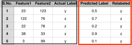
Continuing with the previous post, here, I will illustrate how outlier scores vary while considering different k values. The context of below figure is already explained in my previous post.

Screen Shot 2016-08-22 at 11.02.08

After running the LOF algorithm with following R code lines


library(Rlof) # for applying local outlier factor
library(HighDimOut) # for normalization of lof scores
set.seed(200)
df <- data.frame(x = c( 5, rnorm(2,20,1), rnorm(3,30,1), rnorm(5,40,1), rnorm(9,10,1), rnorm(10,37,1)))
df$y <- c(38, rnorm(2,30,1), rnorm(3,10,1), rnorm(5,40,1), rnorm(9,20,1), rnorm(10,25,1))
#pdf("understandK.pdf", width = 6, height = 6)
plot(df$x, df$y, type = "p",  ylim = c(min(df$y), max(df$y) + 5), xlab = "x", ylab = "y")
text(df$x, df$y, pos = 3, labels = 1:nrow(df), cex = 0.7)
dev.off()
lofResults <- lof(df, c(2:10), cores = 2)
apply(lofResults, 2, function(x) Func.trans(x,method = "FBOD"))

We get the outlier scores for 30 days on a range of k = [2:10] as follows:

Screen Shot 2016-08-22 at 11.11.00

Before explaining results further, I present the distance matrix as below, where each entry shows the distance between days X and Y. Here, X represents row entry and Y represents column entry.

Screen Shot 2016-08-22 at 11.22.44

Let us understand how outlier scores get assigned to day 1 on different k’s in the range of 2:10. The neighbours of point 1 in terms of increasing distance are:

Screen Shot 2016-08-22 at 16.50.30

Here the first row represents neighbour and the second row represents the distance between point 1 and the corresponding point. While noticing the outlier values of point 1, we find till k = 8, outlier score of point 1 are very high (near to 1). The reason for this is that the density of  k neighbours of point 1 till k = 8 is high as compared to point 1. This results in higher outlier score to point 1. But, when we set k = 9, outlier score of point 1 drops to 0. Let us dig it deep further. The 8th and 9th neighbours of point 1 are points 18 and 17 respectively. The neighbours of point 18 in increasing distance are:

Screen Shot 2016-08-22 at 17.02.37

and the neighbours of point 17 are:

Screen Shot 2016-08-22 at 17.03.13

Observe carefully, that 8th neighbour of point 1 is point 18, and the 8th neighbour of point 18 is point 19. While checking the neighbours of point 18 we find that all of its 8 neighbours are nearby (in cluster D). This results in higher density for all k neighbours of point 1 till 8th neighbour as all these points are densest as compared to point 1, and hence point 1 with lesser density gets high anomaly score. On the other hand, 9th neighbour of point 1 is point 17 that has 9th neighbour as point 3. On further checking, we find that for all the points which are in cluster D now find their 9th neighbour  either in cluster A or cluster B. This essentially decreases the density of all the considered neighbours of point 1. As a result, now all the points including point 1 and its 9 neighbours have densities in the similar range and hence point 1 gets low outlier score.

I believe that this small example explains how outlier scores vary with different k’s. Interested readers can use the provided R code to understand this example further.

Intuitive​ meaning of k range in Local Outlier Factor (LOF)

The Local Outlier Factor (LOF) is a well-known outlier detection algorithm. In the previous post, I noted down the steps of LOF and here I will discuss its k parameter.  The k parameter often lands the users of LOF into difficulty, but while looking at the meaning of k parameter and the respective application domain, I find it is easy to select a k range. The authors of LOF suggest to use a range of k values instead of using a selective value. This is because we cannot generalise a particular value of k over various datasets following diverse underlying data distributions. Now, let us understand how to select lower (lwrval) and upper (uprval) values of the k range.

To explain it further, let us consider a simple scenario shown in below figure

Screen Shot 2016-08-22 at 11.02.08

This figure shows the energy consumption of some imaginary home for one month (30 days). Each small circle represents energy consumption of a particular day, where a number above the circle shows the corresponding day of the month.  Nearby circles marked within red clusters  (A, B, C, D, E) represent days that follow a similar pattern in energy consumption as compared to remaining days.

To use LOF on such a dataset, we need to set the range of k values instead of a single k value. Note that lwrval and uprval are domain dependent. According to LOF paper, lwrval and uprval are defined as:

  • lwrval: This refers to the minimal cluster size which consists of similar behaving points, and we believe this similarity is not due to some random cause. This means that we assume a cluster with a size lower than lwrval represent outliers. For example, if I consider lwrval = 3, then clusters A and B represent outliers because none of the points within these clusters has three more similar points/neighbours. At the same time, points within clusters C, D, and E represent normal points because each of them has three more like neighbours.
  • uprval: This suggests to the upper optimal number of points to be similar. In other words, we believe that uprval number of points must be similar in the considered application domain. For example, In the energy domain, I know that at least for 6 days (working days of a week) energy consumption is similar due to the occupancy behaviour. So, I set the uprval = 6. No doubt there can be a cluster with size greater than uprval, but our reasoning on a specific dataset motivates us for some optimal uprval. Consider an another example where we assume that occupants of a home change on a weekly basis – say there were 5,  10, 15, and 20 occupants on the first, second, third and fourth week of a month respectively. Consequently, the energy consumption on four different weeks should be similar intra-week and different inter-week. This example suggests that we should get four clusters corresponding to four weeks and the size of each cluster should be 7 (number of weekdays). So, our uprval is 7 in this example.

I believe now lwrval and uprval limits can be easily interpreted for any application domain. Therefore, according to original LOF paper now we can calculate LOF outlier values on a set of k values defined by lwrval and uprval. In the next post, I will explain the above figure further and show how a particular k value effects outlier score.

Area Under the Curve (AUC): A performance metric

Consider a scenario where we have observations defined by the associated attributes. Further, assume that we know the actual class label of each observation as shown in below figure. [Note: this data is random and there is no relation between I/O]

Screen Shot 2016-08-17 at 15.48.48

Mostly, classifiers predict output in the form of categorical labels, but there are instances where a classifier outputs final result in the form of a score, say a score in the range of [0, 1]. The above snapshot figure shows such a instance, where our classifier predicts output in the form of a score (shown in predicted Label column).

Till this, everything is ok, but the question is how can we compute the performance of such classifiers. I mean, well-known metrics like precision and recall are impossible to compute for such scenarios! Although, humans can attach meaning to theses numbers/score, say we consider a threshold value on predicted label, and the values higher than the threshold are labelled as Z and the values below the threshold are labelled as Y.  On assuming a threshold of 0.8, we get something like this

Screen Shot 2016-08-17 at 16.07.38 

Now, we have categorical labels both in the prediction column and in actual label column. Is it fair now to compute metrics like precision and recall ? Wait, we might get different results for precision and recall if we consider different threshold. Now, it is really troublesome to compute existing well-known metrics for these type of scenarios.

For such type of scenarios, we use another metric known as Area Under the Curve (AUC). The curve is known by the name of Receiver Operating Characteristics (ROC). The ROC curves corresponding to four (A, B, C, and D) different classifiers/methods are shown in below figure as

Screen Shot 2016-08-17 at 16.25.18

The true positive rate  (TPR) give information about correctly identified instances while as false positive rate (FPR) gives information about misclassified instances. The ideal ROC curve have a TPR of 1 and FPR of 0. To extract the meaningful information from these ROC curves, we use AUC value which represents the area under the considered ROC curve. The AUC value ranges between [0, 1]. A value of 1 represents ideal/perfect performance and value of 0.5 represents random (50/50) performance.

The AUC value is computed at various thresholds. So, we can say that the final AUC value is not biased by a single threshold.

LaTeX for Complex Stuff

In this post, I will keep updating solutions to common problems we face while preparing LaTeX manuscripts.

Customise the width of any cell in a table: First include package pbox. Then, cell contents of a table will go like this \pbox{5cm}{blah blabh}. Even the contents of cell can be forced to next line by using double backslash, i.e., \\

Customise width of entire table column: In this case, instead of mentioning l,c,r options of tabular environment for the said column, use p with width . For example \begin{tabular}{|r|c|p{4cm}} [Reference]

Present table in landscape style  [Ref]: Add necessary packages and the syntax to show table in landscape mode is as

\usepackage{floats,lscape}
\begin{landscape}
\begin{table}
…table stuff…
\end{table}
\end{landscape}

Place text and Figure side by side: This question mentions how space around the image can be managed

\usepackage{wrapfig}
\begin{wrapfigure}{r}{4cm} //first option is placement (l,r), second width
\includegraphics[]{abc.pdf}
\caption{}
\label{}
\end{wrap figure}

Show complete paper reference (title, author name, etc) without citation:

\usepackage{bibentry}
\nobibliography*

Write above two lines in the document heading in the same order, and then in the main document, for citing purpose write  \bibentry{paperkey} 

Shrink a table if it moves outside the text area: 

Use resizebox as explained in this Stackoverflow answer.

Local Outlier Factor

Local outlier Factor (LoF) is another density based approach to identify outliers in a dataset. The LoF is applicable to identify outliers in a dataset, which has a mixture of data distributions.

lof
Figure showing the dense and sparse distribution of points [Source: Google images]
The above figure shows two different distributions, a dense cluster of points and a sparse distribution of points.  In such datasets, for each specific distribution within a dataset, we should perform outlier detection locally, i.e., points within one distribution should not affect outlier detection in another cluster. The LoF algorithm follows the same intuition and calculates anomaly score for  each point within a distribution as:

  1. For each data point X , let D^k(X) represent distance of point X to its k^{th} neighbor, and L_{k}(X) represent set of points within D^k(X)
  2. Compute reachability distance for each data point, X  as                                     R_{k}(X, Y) = max(dist(X,Y), D^k(Y))
  3. Compute Average reachability distance AR_{k}(X) of data point X as                         AR_{k}(X) = MEAN_{Y \in L_{k}(X)} R_{k}(X, Y)
  4. In the final step, LOF score for each point, X is calculated as:                                                            LOF_{k}(X) = MEAN_{Y \in L_{k}(X)} \frac{AR_{k}(X)}{AR_{k}(Y)}

To find the best value of k , it is always good to follow ensemble approach, i.e., use a range of k values to calculate LOF scores and then use a specific method to combine the outlier scores.


References:

  1. Book: Outlier Analysis by Charu Aggarwal
  2.  Wikipedia
  3. Google Images

Hacks in Document and Presentation preparation

1. INSERT EQUATION IN PRESENTATION:

At times we need to insert Mathematical formulae in presentations (Powerpoint or Keynote),  and both Powerpoint and Keynote allow this by default. But, for guys, who are much comfortable with latex, then a simple and time-saving way is to copy the latex equation in LaTeXiT utility. Another advantage with this is that you can open the past file for editing at any time with this utility. Two simple steps required are:

  1. Copy latex equation or write at first-hand in the lower window of the utility
  2. Save output as pdf or image file. Note you can change the default font size of text in the same utility. Also, additional packages can be added in preamble through menu as LateX- > Show preamble

Here, is the screenshot of LaTeXiT utility

Screen Shot 2016-07-14 at 12.23.48

2. INSERT EDITED PDF IMAGE IN LATEX DOCUMENT:

Please find the detailed steps at this page of the blog.

Local Correlation Integral (LOCI) – Outlier Detection Algorithm

Local Correlation Integral (LOCI) is a density based approach for outlier analysis. It is local in nature, i.e., uses only nearby data points in terms of distance to compute density of a point. In this algorithm we have one tunable parameter – \delta . Personally, I believe that we need to tune k also according to data distribution. LOCI works with following steps

  1.  Compute density, M(X,\epsilon) of data point X as the number of neighbours within distance \epsilon . Here, density is known as counting neighbourhood of data point X
    M(X,\epsilon) = COUNT_{(Y:dist(X,Y) \leq \epsilon; Y \in datapoints )} Y
  2.  Compute average density, AM(X,\epsilon,\delta) of data point   X as the MEAN(density of neighbours of X within distance,   \delta). Here, \delta is known as sampling neighbourhood of X
    AM(X,\epsilon,\delta) = MEAN_{(Y:dist(X,Y) \leq \delta)} M(Y,\epsilon)

    The value of \epsilon is always set to be half of \delta in order to enable fast approximation. Therefore, we need to tune  \delta for accuracy without touching \epsilon

  3.  Compute Multi-Granularity Deviation Factor (MDEF) at distance,  \delta as                                                                                                                                                                    {MDEF}(X,\epsilon,\delta) = \frac{AM(X,\epsilon,\delta) - M(X,\epsilon)}{AM(X,\epsilon,\delta)}  

    This factor shows the deviation of  M from  AM for  X. Since this computation only considers local/neighbour points, therefore LOCI is referred as local in nature. The larger the value of MDEF, the greater is the outlier score. We use multiple values of  \delta to compute MDEF. Mostly we start with a radius containing 20 points to a maximum of radius spanning most of data.

  4. In this step, the deviation of  M from  AM is converted into binary label, i.e., whether  X is outlier or not. For this, we use  \sigma(X,\epsilon,\delta) metric as
    \begin{aligned}{\sigma}(X,\epsilon,\delta) = \frac{STD_{(Y:dist(X,Y) \leq \delta)}M(Y,\epsilon)}{AM(X,\epsilon,\delta)} \end{aligned}
    Here, STD refers to standard deviation.
  5.  A data point, X is declared as an outlier if its MDEF value is greater than  k. \sigma(X,\epsilon,\delta) , where  k is chosen to be 3.

Reference:

  1.  I have understood this algorithm from book: Outlier Analysis by Charu Aggarwal