Box Cox Transformation

At most times, while dealing with data, I assume that the underlying distribution is normal. Also, I have found that most common statistical measures assume normal distribution of data. But we know that data distributions are not always normal. In simple words, it means that we need to plot the data always so as to confirm the underlying distribution. With plotting,  sometimes we also find that a small transformation ( like x^2 , log(x) ) results in normal distribution. This means that data transformations can make our life simple and allow us to use statistical measures intended form normally distributed data.

Box Cox Transformation: George Box and Sir David Cox came out with a transformation formula which uses different values between -5  and 5  of a parameter (\lambda) to perform transformation. In other words, this formula finds the best value at which data can be represented normally.

\displaystyle { x }_{ \lambda  }^{ ' }  =  \frac { { x }^{ \lambda  } - 1 }{ \lambda  }

\lambda=0 results in log transformation.  It is not guaranteed that data will always get transformed to normal distribution.


Reference:

  1. https://www.youtube.com/watch?v=EJ6EhfenqNs
  2. https://www.isixsigma.com/tools-templates/normality/making-data-normal-using-box-cox-power-transformation/

ARIMA, Time-Series Forecasting

We use ARIMA (Auto-Regressive Integrated Moving Average) to model time-series data for forecasting. ARIMA uses three basic concepts:

  1. Auto-Regressive: The term itself points to regression, i.e., it predicts new value using regression over the previous lagged values of the same series. The lags used define its order
  2. Integrated: This concept is used to remove trend (continuously increasing/decreasing time-series) from the time series. This is done by differencing consecutive values of time-series.
  3. Moving Average: In this we perform regression by using the error terms at various lags. The lags used define its order

ARIMA works only on stationary data. If the input data is not stationary (detected via automated tests, i.e, different unit tests like famous Dickey-Fuller test), then stationary is achieved via differencing approach. The ARIMA forecasting equation for a stationary time-series is regression type equation in which predictors consist of previous response values at different lags. This also includes forecast errors at different lags.

Predictor (y)\quad =\quad C\quad +\quad Weighted\quad sum\quad of\quad previous\quad y\quad and\quad previous\quad errors\quad at\quad various\quad lags

Auto-regressive models and exponential smoothing are all special cases of ARIMA models


References:

  1. http://ucanalytics.com/blogs/arima-models-manufacturing-case-study-example-part-3/
  2. http://people.duke.edu/~rnau/411arim.htm

Stationary Time-series Data

Before fitting any existing model to time-series data we check for different things

  • Stationarity of time series: Stationarity  of time series is ensured by three properties [1].  A pictorial depiction of these properties is shown at link
    • The mean of time-series (xt) is the same for all xt .
    • The variance of time-series (xt) is the same for all xt .
    • The covariance (and also correlation) between xt and xt-h is the same for all t.

We care about stationarity because most time-series models  assume stationarity. Also, a time-series can be stationarized by detrending and differencing.


References :

  1. https://onlinecourses.science.psu.edu/stat510/node/60
  2. http://www.analyticsvidhya.com/blog/2015/12/complete-tutorial-time-series-modeling/


Non-parametric Regression/Modelling

In parametric regression/modelling we set different parameters to model our data. Say if w know the underlying data distribution is normal then we can set different combination of mean and standard-deviations until the model will reflect underlying data perfectly. All right! But how will you model the data if you don’t know the underlying data distribution. For example, in the below figure, underlying data distribution is uniform but on assuming that data is normal we got the estimate as shown, which is normal. This shows that we cannot rely on such parametric models if are not sure of underlying data distribution.Screen Shot 2016-05-11 at 14.40.13

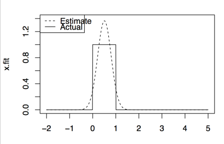
Non-Parametric Regression/Modelling or Kernel Density Estimation: In this, we use underlying data and some kernel function to model the data. The main idea is that at the point of interest we observe the neighboring points and  estimate value as a function of there positions/values. The neighboring points get weights according to kernel function used. The most common kernel function used is Gaussian kernel. Please find remaining  kernels used at this wiki link. An important tuning parameter in this technique is the width of the neighboring region considered for estimation, commonly known as bandwidth. This parameter controls the smoothness of estimation. Lower values results in more tightness but also include some noise, while as higher values result in more smoothness. But computing optimal value of bandwidth is not our concern as there exist number of approaches which calculate this value. The effect of bandwidth using  Gaussian kernel is shown in below figure.

Screen Shot 2016-05-11 at 14.52.59.png

This shows that automatic selection of bandwidth parameter is good enough to represent to underlying data distribution.

R code

set.seed(1988)
x = runif(700,min=0,max=1)
x.test = seq(-2,5,by=0.01) 
x.fit = dnorm(x.test,mean(x),sd(x))
x.true = dunif(x.test,min=0,max=1)
bias = x.fit-x.true
#plot(bias~x.test)
plot(x.fit~x.test,t="l", ylim= c(0,1.4),lty=2)
lines(x.true~x.test,lty=1)
legend("topleft",legend = c("Estimate","Actual"), lty = c(2,1))
###########kernel density plots######
 set.seed(1988)
 ser = seq(-3,5, by=0.01)
 x = c(rnorm(500,0,1),rnorm(500,3,1)) # mixture distributions
 x.true = 0.5*dnorm(ser,0,1) + 0.5*dnorm(ser,3,1)
 plot(x.true~ser,t="l")
par(mfrow=c(1,4))
# Guassian Kernel
 plot(density(x,bw=0.1),ylim=c(0,0.3),lty=2, main="Gaussian Kernel, bw=0.1")
 lines(x.true~ser,lty=1)
 legend("topleft",legend = c("Actual","Estimated"),lty=c(1,2))

 plot(density(x,bw=0.3),ylim=c(0,0.3),lty=2, main="Gaussian Kernel, bw=0.3")
 lines(x.true~ser,lty=1)
 legend("topleft",legend = c("Actual","Estimated"),lty=c(1,2))

 plot(density(x,bw=0.8),ylim=c(0,0.3),lty=2, main="Gaussian Kernel, bw=0.8")
 lines(x.true~ser,lty=1)
 legend("topleft",legend = c("Actual","Estimated"),lty=c(1,2))

 plot(density(x),ylim=c(0,0.3),lty=2, main="Gaussian Kernel, bw=automatic")
 lines(x.true~ser,lty=1)
 legend("topleft",legend = c("Actual","Estimated"),lty=c(1,2))

References:

  1. https://www.youtube.com/watch?v=QSNN0no4dSI
  2. https://en.wikipedia.org/wiki/Kernel_(statistics)


PDF, PMF, CDF

Probability Density Function (PDF): This function gives the likelihood of a continuous random variable at a particular value. In the discrete cases, we call this by the name of probability mass function (PMF).

Cumulative Distribution Function (CDF): This function gives the accumulative probability of all the values less than or equal to a particular value. In other words, CDF gives accumulative probability from (negative) infinity to a said value.

Probability at a certain value is obtained by PDF or PMF depending on the case, while as probability of values less than x or probability between the range is obtained via CDF [1]. Basic R code to understand each of these functions is explained at this link.


References:

  1. http://math.stackexchange.com/a/697467/270045
  2. https://onlinecourses.science.psu.edu/stat414/node/88

Spline Regression [Piecewise polynomials]

Mostly, we have two ways to fit a regression line to our data:

  1. Use single Linear/Non-Linear regression line to fit data
  2. Fit more than one linear/non-linear regression lines to different parts of data. This is known as spline regression. We go for this because polynomials are not flexible enough to model all functions.

First case is straightforward. In the second case, more than one linear/non-linear piecewise polynomial is fitted to data. These lines are connected at points known as “knots”. This has certainly advantage as instead of fitting a single higher order polynomial to represent non-linearity in data, we use different low-order polynomials. This results in simplicity and also obeys the principle of parsimony (Occam’s Razor), which is [1]

  1. models should have as few parameters as possible
  2. linear models should be preferred to non-linear models
  3. experiments relying on few assumptions should be preferred to those relying on many
  4. models should be pared down until they are minimal adequate
  5. simple explanations should be preferred to complex explanations

The following figure [2] shows how two splines are added to data in different scenarios.

Screen Shot 2016-05-10 at 19.04.53.png

The only issue with this regression is  Knot selection, but with improved libraries this issue is handled easily. Some common terms include:

  1. Linear splines – Piecewise linear polynomials continous at knots. In cubic spline, it is piecewise cubic polynomils
  2. Natural spline –  According to John, it is fancier version of cubic splines. It adds constraints at the boundary which helps in extrapolating function linearly beyond the boundary knots.

With sayings of John, polynomials are more easy to think, but splines are much better behaved and more local.

References:

  1.  Book –  Statistics An introduction using R by Michael J. Crawley
  2.  Book – An Intro to Statistical Learning by Gareth James et. al
  3. John, i.e., Trevor John Hastie, Professor at Stanford

Heteroscedasticity (Non-Constant variance)

In linear regression, It is assumed that the variance of error terms is constant. Technically, this is known as Homoscedasticity (or same variance). In simple language, with the inclusion of new predictor observations the variance of error terms should not change as against to the previous predictor observations. For example, if we say there is a correlation between the income and shopping done by a person, then it is assumed that people with lower-income will do less shopping and with higher income will do more shopping. The intuition says that the  variance of error terms (difference between actual vs. predicted shopping)  should remain constant, but what if we find that people with higher income do less or moderate type shopping. This type of situation results in variable variance in the error terms, technically known as Heteroscedasticity.  In the dataset, Heteroscedasiticity is identified by plotting residuals with respect to response variable. Presence of funnel shape confirms heteroscedasticity. This can be removed by introducing transformations.  Figure on the left plot shows the presence of funnel shape ( i.e., Heteroscedasticity). On transforming, the response variable (Y) through log transformation we obtain right plot in the below figure. This shows that tranformations of either predictor or response variable removes heteroscedasticity.Screen Shot 2016-05-06 at 11.52.07.png  Note: Figure taken from book – An Intro. to Statistical Learning by James et al.

References

  1. http://www.statisticssolutions.com/homoscedasticity/
  2. Book – An Introduction to Statistical Learning by James et al.

Unload your R packages

Very few times, we want to unload either some of the selected packages or all of the packages. Although there is a simple way around it,  i.e., to restart the R session, but this gives a lot of pain by re-running each functions on reload. While dealing with the same situation, I found a simple three line code  from Stack Overflow link. Here is the code

pkgs = names(sessionInfo()$otherPkgs) # finds all the loaded pkgs
pkgs_namspace = paste('package:',pkgs,sep = "")
# please find ?detach for meanings of option used
lapply(pkgs_namespace,detach, character.only=TRUE,unload=TRUE,force=TRUE)

To remove a specific package say xyz, we use

detach("package:xyz") # please use ?detach for options


Please excuse, if any typos found


Identify Collinearity in Multiple Predictor Variables

Fitting a correct model to data is a laborious task – it needs to try various models to find the relation between predictor variables and a response variable. Before fitting a model to data we need to ensure that data is standardised. Standardisation ensures that each predictor variable is on the same scale. For example, although human heights do not vary too much in range but the weight varies too much among individuals. This means the scale of heights predictor is small as compared to weight. We should not use them directly for modelling. Instead, both of the predictors should be brought on the same scale. This is what standardization ensures. Generally, in standardization, we center and scale our predictors, i.e.,

  • Center: In this step, we subtract the mean of a predictor variable from each respective observation of the same variable. This ensures that mean  of resultant predictor variable is zero. Hence, our predictor variable gets centered to 0 (zero)
  • Scale: In this step, we divide each predictor observation by the standard deviation of the predictor variable. This ensures that the standard deviation of resultant predictor observation become 1.

Therefore, with standardization, all of our predictors have 0 mean and standard deviation of 1. All right, now all the predictors are on the same scale and we can apply any of your favourite machine learning algorithms. After standardization, we should check for collinearity – is there any correlation between predictor variables? If there exists correlation, that means both of your predictors are explaining the same thing. In other words, if the two predictors are correlated then one variable over the other is not explaining anything extra of the response variable.

With this, a simple question arises, if any predictor is not explaining anything extra about a response variable over the other predictor, then why should we include extra predictor. Using correlated predictors unnecessarily makes our model complex and wastes extra computing cycles. Therefore, It is always encouraged to identify such correlated predictors and remove one of the predictors from the pair. A simple algorithm used for removing highly correlative predictors is mentioned in book “Applied Predictive Modelling” as

  1. Calculate the correlation matrix of the predictors.
  2. Determine the two predictors associated with the largest absolute pairwise
    correlation (call them predictors A and B).
  3. Determine the average correlation between A and the other variables.Do the same for predictor B.
  4. If A has a larger average correlation, remove it; otherwise, remove predictor B.
  5. Repeat Steps 2–4 until no absolute correlations are above the threshold.

Another simple way is to draw scatter plot and see if you can spot any linearity effect between any of two variables. In R, pairs() command is the best to find the collinearity effect.

Reference:

  1. Book – Applied Predictive Modelling by Max Kuhn
  2. Book – An Intro. to Statistical learning by Gareth James et al.


Parallel Programming In R

In R, often times we get stuck by the limited processing power of our machines.  This can be easily solved by using parallel processing. In R, there are various libraries which enable parallel processing, but here I will use only parallel library.

Example: Here, I will explain a simple scenario of parallel package usage. Consider I have a data frame with thousand rows and two columns. Now, I need to compute the sum of each of 100 subsequent rows, i.e, I want to compute sums of rows c(1:100), c(101:200) ,…, c(901:1000) in parallel. This means I won’t compute sums in serial manner.


library(parallel)
# Create a dummy data frame with 1000 rows and two columns
set.seed(100688)
df = data.frame(x=rnorm(1000),y=rnorm(1000))
no_cores = detectCores()-1# No. of cores in your system
cl = makeCluster(no_cores) # Make cluster
# Generate list of indexes for row summation of data frame
indexs = seq(from=1,to=1000, by =100)
clusterExport(cl,'df') # pass parameters on-fly to the threads
start_time = Sys.time() # start time of parallel computation
parallel_result = parLapply(cl,indexs,sumfunc)
total_time = Sys.time()-start_time # total time taken for computation
cat ('Total_parallel_time_taken',total_time)
stopCluster(cl)

sumfunc = function(ind) {
# Computs row sum of 100 rows starting with the index, ind
rowsum = colSums(df[ind:ind+99,])
return (rowsum)
}

# More than one parameter can be sent in the form of a list as
clusterExport(cl,list('xx','yy','zz') # parameters sent on-fly

Other Related Blogs:

  1. How-to go parallel in R – basics + tips
  2. A brief foray into parallel processing with R
  3. Parallel computing in R on Windows and Linux using doSNOW and foreach